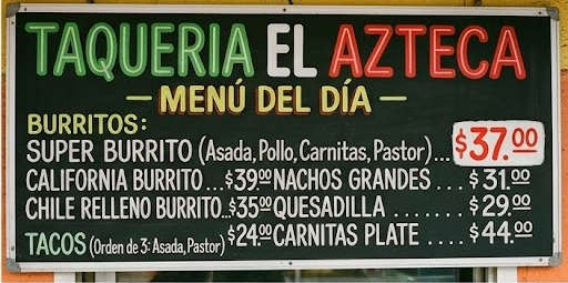
I can’t pinpoint exactly why, but this image feels AI generated to me. It’s like the typography and formatting is both paradoxically too professional and too sloppy in a combination you’d never see in real life.
edit: some observations: title isn’t centered, character widths are inconsistent, no separation between columns, why would you highlight a price on the menu instead of the item?
It’s the overly perfect chalkboard style lettering. It’s like it’s rounded sans serif but hand written in a way that’s too even.
The letters aren’t the same width from line to line, and the ellipses/period spacing isn’t the same from line to line (but is perfect on any given line).
Basically, any typed sign in InDesign or similar software would’ve been more even between lines, and any hand-drawn sign would’ve been more imperfect on any given line.


I can’t pinpoint exactly why, but this image feels AI generated to me. It’s like the typography and formatting is both paradoxically too professional and too sloppy in a combination you’d never see in real life.
edit: some observations: title isn’t centered, character widths are inconsistent, no separation between columns, why would you highlight a price on the menu instead of the item?
It’s the overly perfect chalkboard style lettering. It’s like it’s rounded sans serif but hand written in a way that’s too even.
The letters aren’t the same width from line to line, and the ellipses/period spacing isn’t the same from line to line (but is perfect on any given line).
Basically, any typed sign in InDesign or similar software would’ve been more even between lines, and any hand-drawn sign would’ve been more imperfect on any given line.
Yeah, the U.S. stole the “$” from Spain, but, for example, Mexico actually inherited its use from Spain.
A menu having “$” doesn’t necessarily mean the prices are in U.S. Dollars.