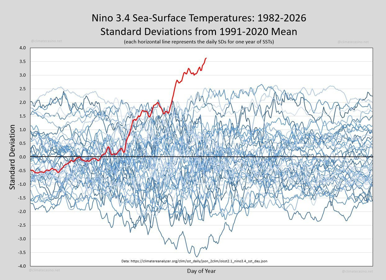
Every so often the Earth produces a signal that is impossible to ignore. This graph is one of them. It shows sea-surface temperatures in the Niño 3.4 region of the equatorial Pacific, one of the most important parts of the Earth's climate system. Each blue line represents a different year since 1982. The red line is this year. It doesn't just set a new record. It has departed entirely from the range of previous observations.If this graph represented stock market prices, a new Olympic record or a


Over the past year, books like Hunger Games have started to feel unsettlingly prescient. But perhaps we can skip that dystopia altogether and instead careen directly toward the Mad Max world.
Skip THAT dystopia.
Oops
We all make mistakes.
If you haven’t yet, you should read Octavia Butler’s Parable series, it’s a far more realistic take and she was very prophetic about certain things.