IRL Africa is about as wide as it’s tall; it’s as far from Benghazi to Cape Town as from the mouth of the Gambia to the tip of the Horn of Africa, but on this map it’s around a 2:3 ratio.
Ironically, the most natural-looking part of this map is Europe. All other landmasses are either at a latitude that stretches the proportions or at a longitude that skews them.
Well there is no way to preserve the scale of all land masses properly since you’re projecting a 3D object onto a 2D plane. This projection at least partially addresses the issue of land masses near the poles being away to big than they actually are. I feel geographically Europe is in a position where the distortions are minimized, at least in the case of projections that don’t have weird layouts.
Behrmann would make a lot more sense. The average person lives at 30 degrees latitude, and it works at all longitudes.
If you’re in the 6% of the population that lives above 45 degrees latitude, I agree the distortion kind of sucks, so please look at the flag of the United Nations until you feel better.


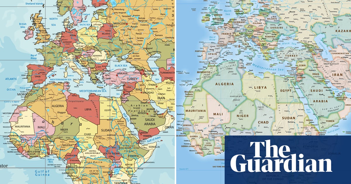
Ew, everything at the equator is so skinny.
IRL Africa is about as wide as it’s tall; it’s as far from Benghazi to Cape Town as from the mouth of the Gambia to the tip of the Horn of Africa, but on this map it’s around a 2:3 ratio.
Ironically, the most natural-looking part of this map is Europe. All other landmasses are either at a latitude that stretches the proportions or at a longitude that skews them.
Thanks I hate it already.
Well there is no way to preserve the scale of all land masses properly since you’re projecting a 3D object onto a 2D plane. This projection at least partially addresses the issue of land masses near the poles being away to big than they actually are. I feel geographically Europe is in a position where the distortions are minimized, at least in the case of projections that don’t have weird layouts.
Behrmann would make a lot more sense. The average person lives at 30 degrees latitude, and it works at all longitudes.
If you’re in the 6% of the population that lives above 45 degrees latitude, I agree the distortion kind of sucks, so please look at the flag of the United Nations until you feel better.