
Source from HN because they have shadowbans: https://news.ycombinator.com/item?id=47773594
I’m wondering too what you are looking for in a font. Good looks, features, options to enable or disable, ligatures?
Source from HN because they have shadowbans: https://news.ycombinator.com/item?id=47773594
I’m wondering too what you are looking for in a font. Good looks, features, options to enable or disable, ligatures?
Yea, as its only applied to italics its less distracting than it might seem at first. Your IDE may not even use italics. In VSCode with my theme, italics are used for comments and variable names, which looks like this: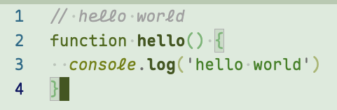
I like to use this style of italics for keywords. (That’s also what the Maple examples do.) My thinking is you see keywords so often that you recognize them by shape, not by reading the individual letters. And my theory is that the italic variant being a little harder to read helps my eyes skim over keywords, to focus more on words that I do need to read precisely, like variable names.
It does mean that I spend some time customizing my syntax highlighting theme to make it work the way I prefer. I’ve got examples set up on my blog. Although that’s not Maple - it’s a different font with cursive italics called Cartograph CF.
Oh wow that looks pretty and also makes total sense in theory. I think I have seen it in other places as well and might just steal that. :) Thank you for pointing that out.
Why is ‘l’ the only cursive letter (and not connected to anything)? It’s kind of jarring
I don’t like that one and the same character looks different on the same line (here
console.log).