- cross-posted to:
- privacy@programming.dev
- cross-posted to:
- privacy@programming.dev
Arguably more security than privacy, but this made me think. I havent considered the use of ambiguous fonts in phishing before. Worth reading.
You must log in or register to comment.
I̶̹͊̂ ̵̢̮̬̻͙̹̦͈̜͕̖̠̱͒̃͗̎̑̕͠o̸̧̬̜͚͕̠͍̓̾̉n̷̥͔͕͈̭̦̲͓̼͍̣̪̝͗̀̓͗͜ḷ̵̢̛̅̓̓̐͝y̶̧̨̢̠͙̰͍̖̞͍͙̳̩̠͈̋͋͒̍̏̓͂̋͘̚͘ ̴̢͎͇͍͉̗̭̎͜͠ṷ̴̱̺̣͚̱̀̄͆͛̈́̀͗͒̓̇̓̇s̶̠̮͂̌̾̋ͅe̸̡̢̛̦̻̙͉͂̓́̉̏̅̓̓̒̋͘͝ ̶̢̡̬̩̯̫̱̪̫͚̱͓͉̗͑͜Ż̶͕̮͔̙̜̞̕͝a̸̡͂͛̽̓͆͌̅l̶̛͖̼̲͚̳̓͐͂̊̒͂̄͂́̿̎̒͊̒̕ǵ̶̰̩̮̹̤̺̫̥̹̹͙̌͆͋̒o̶̧̲̟̬̻̳͖͗̉̈́̓͌͗̿̅͌̂͆̈͘̕̕ ̷̡̙̩̰̦̯̄́̿͠F̶͔͙̱̞̘̯͇͖͍̱͍͖̺̯͋́̑̓̀̈́͌̍̏͌̉̄̋̇͘͜͝o̵̮̫͖̙̟͈̬̽̃̔̇̔̈́́͒̏̃͐͘͘͘ͅn̶̨̞̠͖͓̗͕̙͈̙̥̟̈́̈́̔̃̓̿͂̆̈́̌ṱ̸̢̧̩̗̮͔͔̲̖̺̯͇̩̟̈́̈́͗̊̐̈́̐͆̽̄̂̔̇͒̚ͅ
While this is a very special and interestng use of this attack vector, I do think it often gets too much focus, mostly because it’s ignoring a much bigger problem: The average person doesn’t even know what the legit URL of a website should even be, and that starts with the TLD. Was it .com? Or maybe .org? Maybe some country-TLD or maybe one of the thousands of new TLDs like .world or .finance? If you don’t have a perfect memory of every URL of all the websites you’re using, being able to inspect the exact shape of each letter isn’t going to help you.
TIL I’m not the average web user. Not suprising, since I use Arch (btw), and I’ve done web dev projects. Do average people really just look up the url every time?
My dad used to put “Google” in the omnibar (adressbar), hit enter, then click the first Yahoo search result for google.com, then enter his actual search query into Google.
Remarkable.
that’s why mono fonts are best
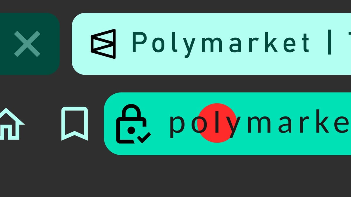
And wouldn’t you know, the Wall Street Journal revealed that the Polymarket set up a fake version of their website and named it PoIymarket. (Did you catch it?)
PoIymarket (spelled with a capital “i” instead of a lower case “l”), is a fake version of their platform.
what difference a mono font would make with the I & l difference?
It would make those characters more distinct. Should be able to see it here with a code line. The letter O and the number 0 also have more noticeable differences that go beyond what serif fonts can do
Capital I
Lowercase l
Number 1
Capital O
Number 0
Doesn’t need to be mono to fix it. Look at Atkinson Hyperlegible
mono fonts just address this consistently as opposed to case by case for sans serif type
i thought this is common knowledge with tech people. I heard years ago about swapping of the cyrillic „a“, maybe thats why.
Yeah. Here are some resources for interested people