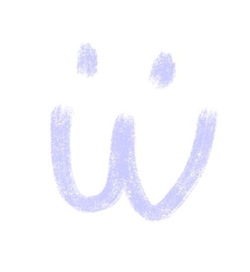
I don’t even know what it’s called, but I really hope it goes the way of Comic Sans
Edit: does anyone actually know what this awful font is called?
Just found another one in the wild
A YouTuber I used to adore has gone to this shitty ai thumbnail format in recent months, so I’ve stopped clicking on him 😞
Wrestling-Sans
Why is it that all AI fliers look like this though?
Because they made that the default look for flyers somehow
This is an insult to comic sans. Comic sans is a good font and helpful to people with dyslexia
It is? I’ve seen a couple fonts meant to combat dyslexia and they look very different from comic sans
Fascist tech-bro slop font? Just in case it doesn’t have a name I’d like to throw this in the ring.
This is an insult to Comic Sans
Yeah, Comic Sans is actually useful.
Yes! It feels like every second restaurant in my area has suddenly gone with this font and AI slop images for their menus. Lets call it Tragic Sans or something like that.
I see that, I go elsewhere.
Tragic Sans is pretty great. Also saw Toxic Sans somewhere and really like it.
I was JUST thinking about how I see this on a bunch of ai slop and slop adjacent stuff recently!
It’s weird be cause you would think that whoever makes these should have the common sense to see if it’s a bit too obvious or too typical. You can use just about any font in existence in AI by just telling it to use that font, but lazy ass people choose the crypto chud font.
You’re telling me they could be generating posters with Papyrus, Joker, or Wingdings font, and don’t?
Missed opportunities
It’s an absolutely insane test of my faith in humanity. It just takes like 10 more words to get AI to make a sign that’s at least a little different from the slop. But they won’t even do that. It’s like they’re spitting in their own face with the disrespect they show to their own businesses or whatever they’re advertising. It’s nuts.
At least comic sans is easy on the eyes. easy to read.
You might need new glasses.
That is literally one of comic sans upside. Its objectively speaking easy to read. Its one of the better fonts for people with dyslexia and reading difficulties.
People hate on it because memes and ignorance. Also the absolute over use making people sick of it. But those are subjective things.
What I come to call the “300” typeface because it’s what all AI slop posters are like now. They’re more or less based on “Edo SZ” which has seen very frequent use.
I first took a note about it in Like a Dragon\Yakuza games, where it’s used for title script of chapters, tasks, encounters with enemies. They got trendy for a while after starting to rerelease on many platforms including PC.

It isn’t really a specific font, just something AI models made to generate images have picked up on. Things that were immediately attention grabbing and bold probably got more positive scoring and reinforcement during training, so they learned to use larger more dramatic styles (this is also why you often see sort of electric or fiery glows, sparks, dramatic lighting, etc) but that doesn’t really work to help a business stand out when all of them now look like that.
I’m also not sure if everyone knows this yet, but most AI image generators nowadays are split into two parts. It used to be that you’d need a prompt like
poster, graphic, promotional, large text, dramatic, brushstroke font, on sign, city background, club background, microphone, This Font is the New Comic Sans bold text, high quality, but since most people do this shit through something like ChatGPT, and might just say “make me a poster that says ‘This Font is the New Comic Sans’”, in the background, an LLM takes that prompt and makes a more extended prompt for the image generator.This is where a lot of this type of thing probably takes place. For example, I prompted an AI model with
Convert this prompt: "Make me a poster for my nightclub" into a Stable Diffusion prompt for a poster, and it gave me: nightclub event poster, bold neon typography, vibrant magenta and electric blue lighting, silhouetted dancers in motion, smoke and laser beams, glowing geometric shapes, dark moody background, high contrast, synthwave aesthetic, centered composition, space reserved for event title and date, ultra detailed, sharp focus, professional graphic design, 8k (emphasis added by me)Nightclub posters do sometimes have these elements, but a lot of them actually use clean typography, little to no neon inside the typography, it just made up synthwave as a relevant aesthetic to the club it knows nothing about, and simultaneously wants a dark and moody background… with something that has high contrast, neon lights, lasers, and lighting everywhere.
Both image generators and LLMs optimize for things that are bold and for excessive additions like you saw in the prompt earlier, which leads to the super sloppy, over the top, crowded designs you see on most AI posters.
The LLM / image gen AI centipede.
This fucking shite

What on the fucking love of God is eBay live? Do we not even pretend anymore that’s content and go straight to TV selling channels?
Tiktokification. Every app has a reels clone, because that shit is addicting and works at keeping people engaged.
eBay is jealous of Whatnot and is trying to copy them
What?
not
Those faces in the bottom left corner are horrifying.
Mouths of a feather slop together
So many fingers
Octoberfest this year had a lot of stands, all with the same AI slop posters. I bought a burger from a stand with just a handwritten sign. Felt good.
What gets me is they’re all the same style. Do they not see that their posters are the same as everyone else’s??
You have far too much faith in taste.
Anyone competent enough to understand that effort is a vital component of modern marketing is already steering clear of AI slop nonsense. It’s the stupids that are left believing that doing something as cheaply and easily as possible won’t reflect poorly on their business.
and good lord there’s a lot of stupid people out there.
I have a lot to say about how and why, but i think these people though their posters looked good before they saw everyone have the same style.
Like how Walmart and Target are competitors, but their themes complement each other as to what we expect from their stores. It’s something a successful business can’t ignore. See power tools brands have all cornered their respective color theme, but up close they all perform similar to our expectations before anything else.
So AI steps in, advertised it can make posters now, and people believe it. Either they can’t afford an artist, or don’t care enough to consider. Swaths of salt-of-earth businesses jump to use it, naively, and kinda out themselves accidentally as the amateurs they are.
Everyone sees it, and realized too late. I think that style will die off pretty quickly if business owners know what’s good for them.
It’s just so absurd that AI as a solution is just again, seen as another poison to the thing it’s supposed to solve. If I were to write a story about it, I couldn’t make it up. The absurdity has it’s own gravitational pull.
They each probably thought they had this great idea of getting a crazy unique AI sign before they showed up and saw that everyone had the same idea.