
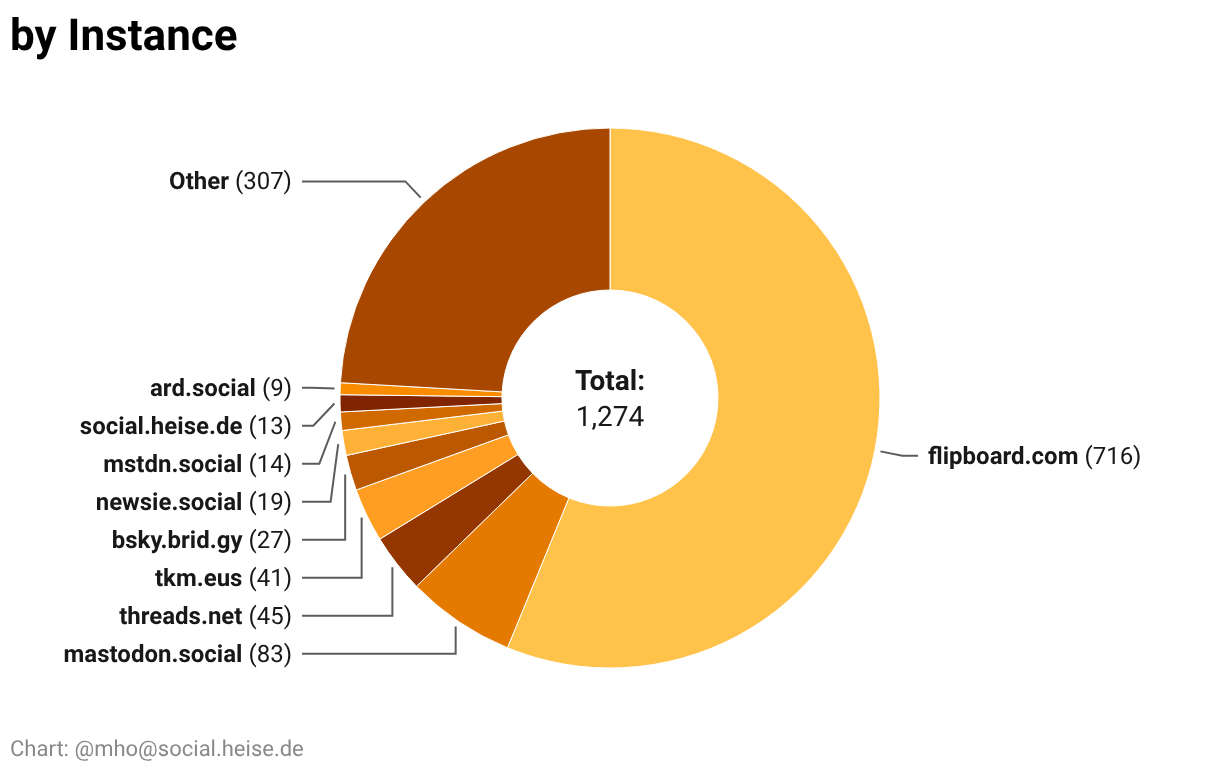
It’s now way prettier and contains almost 1300 accounts.
You can show/hide columns, there is a powerful custom search and a button to download an CSV with the handles of all visible accounts for import. There’s also the language, the country of origin, and a direct link.
I found their explanation and as I suspected, they don’t want to distract you. 😉 https://www.datawrapper.de/blog/pie-charts But they’re also saying, that this is not the right chart for so many values. So I’ll retry.