

Removing the color-coding of mimetypes, for accessibility for “color blind” people. (Like me!)

(this is not my work, just posting here)
Removing the color-coding of mimetypes, for accessibility for “color blind” people. (Like me!)
(this is not my work, just posting here)
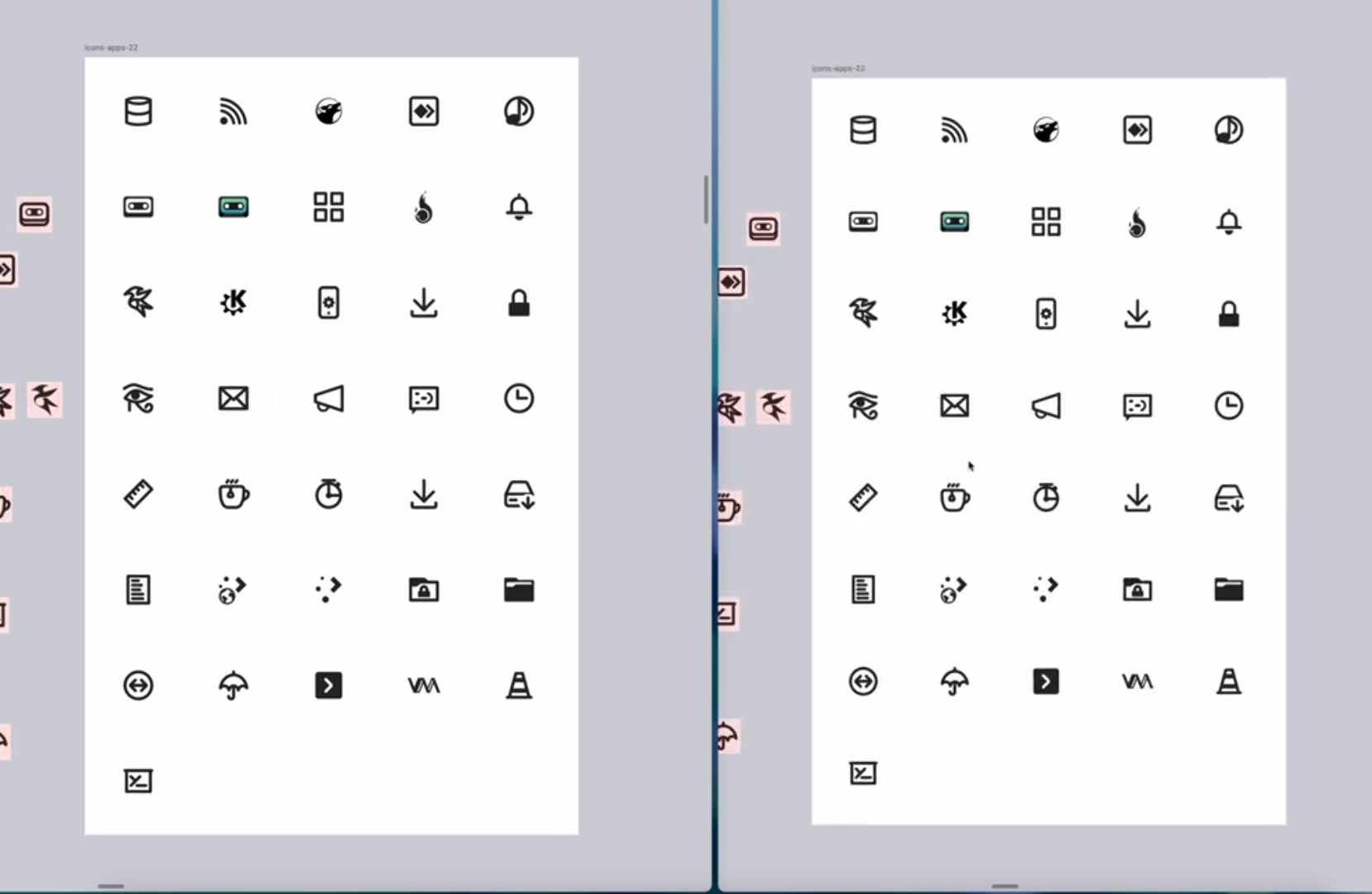
Interesting! Yes I think the Breeze icons are pretty good but look bad anyways. The sharp edges, and 1px are an issue when fractional scaling.